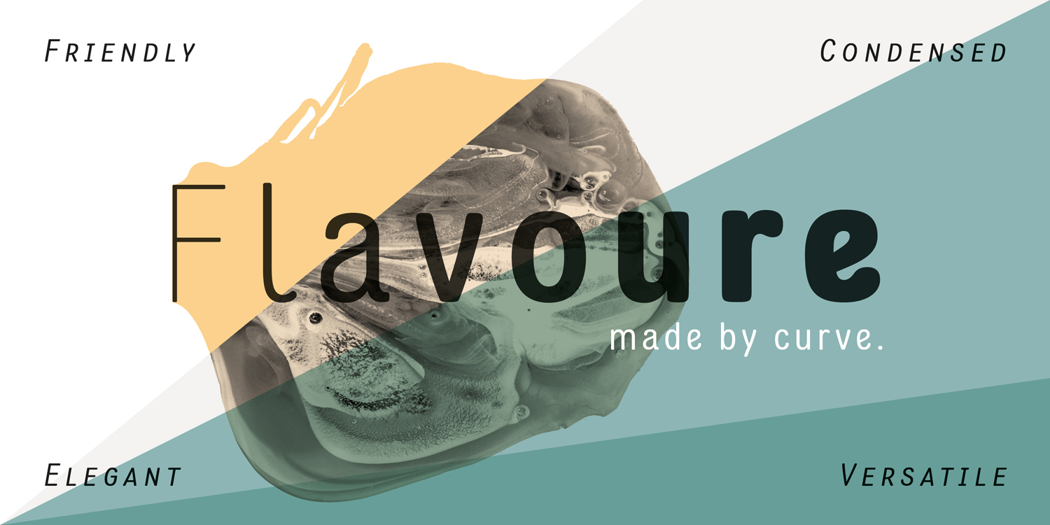


Flavoure — Typeface
Wuuuiiihh… after a few years have passed, I can finally tick the font project, which got on my nerves while working on it. Designing a typeface and getting it ready for sale – especially as a family with multiple weights and a large character set – is real work, and a good part of that work is dull and technical – pretty much the opposite of how I prefer to work. Long breaks and “coming back in” are obligatory, cumbersome workflows are only noticed late – thanks at this point to Volker Schnebel from URW for the support and the repeated answering of my techn. questions until the artist brain understands. All the better that the flavour now sees the light of day and is sold by various distributors. It was a long way from the first sketches on paper to the final look, and the way from the analog to the digital, the “manual” look that was initially even more clearly visible has given way. In contrast to lettering or other letter-based designs, fontdesign means creating a system; that fact I’d already realized while working on a previous font project and getting this system tight, some things need to left out, shapes have to be adjusted and “outliers” have to be captured.
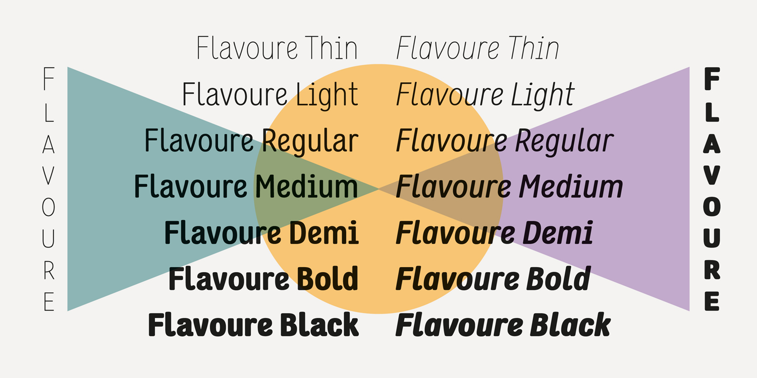
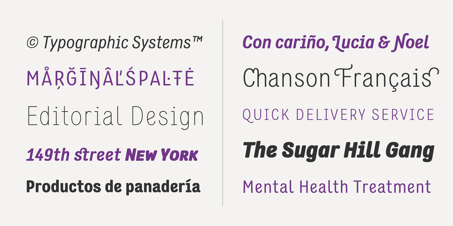
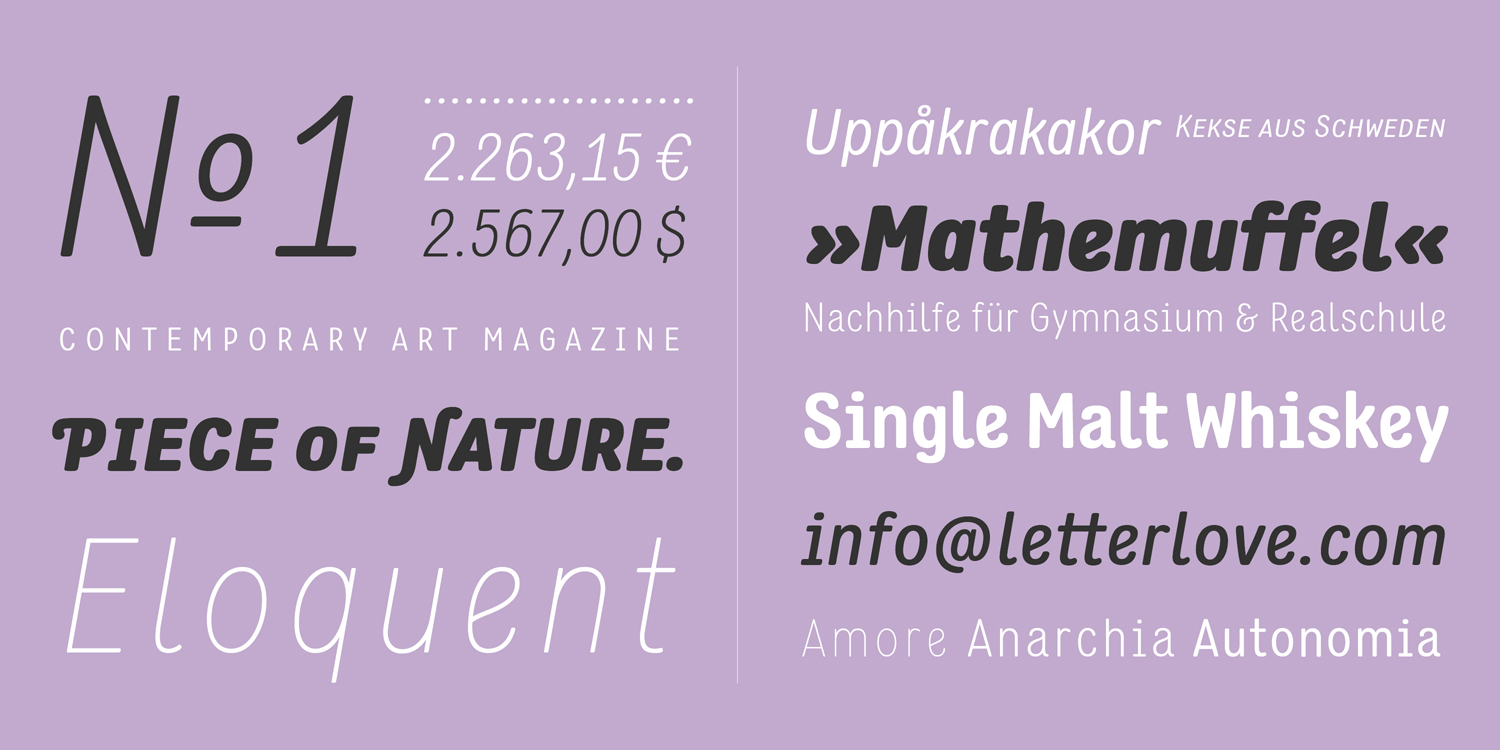
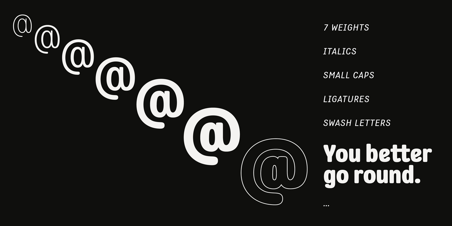
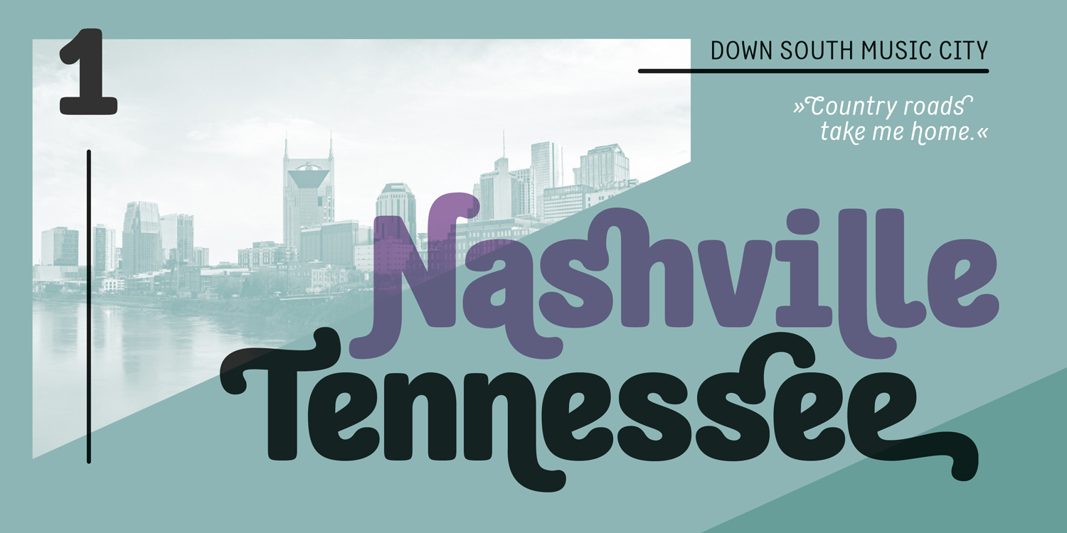
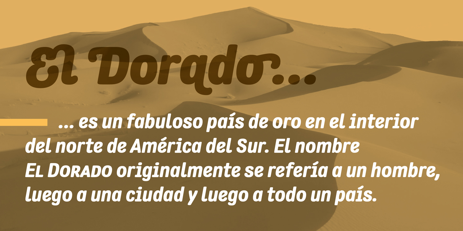
The flavor of the Flavoure is special – designed from the start as a truly display font, there’s no hazard for using in smaller sizes or longer texts. Not a workhorse of course, which you choose for a book-layout, but it can be used in a variety of different areas quite beneficial. Real italics, an extensive set of small caps, swashes, a comparatively large set of ligatures and other OpenType features make the 750-character font (Latin 1 & 2) ready to type.